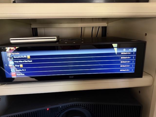
Please see the display below. Much “real estate” is wasted.
There is a lot of empty screen space after the title. Please allow a shorter space for the title and add the album and a longer space for the artist.
StandardModel

Please see the display below. Much “real estate” is wasted.
There is a lot of empty screen space after the title. Please allow a shorter space for the title and add the album and a longer space for the artist.
StandardModel
We understand your request, but we plan to keep the listing as is.
Modifying the display will take a lot of time, and we cannot accommodate all requests.
If modifications are necessary, we will do so after reference.
Rosehan,
Thank you.
What is “reference”?
StandardModel
Sorry for the misunderstanding.
I was going to say that I would review the parts that needed to be revised internally and make the necessary revisions.
Rosehan,
Thank you very much. I appreciate your response.
StandardModel