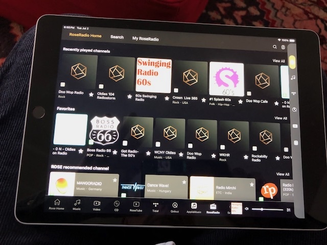
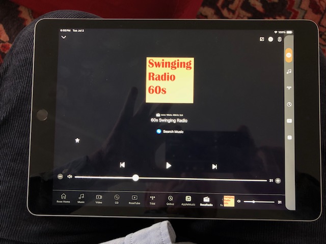
I have stated previously that I had a very hard time finding the RoseConnect radio station screen where the whole station is displayed and Shazam is shown. This is because the selection process is unnecessarily awkward.
Here is the problem starting with the My Rose Radio screen:
If one selects a radio station to play, what happens? It doesn’t play, it becomes a tiny little icon in the lower right hand corner of the selection tray. IF one figures this out and then clicks on the little icon ONLY THEN will one get to the screen with the radio station. Please eliminate this intermediate step as it adds nothing and only makes choosing a station more difficult. When one selects a station just go to the station screen bypassing the station icon in the tray.
Also, when you do get to the station page its picture fills only a tiny portion of the screen. Why not a bigger one? I do realize you can get a bigger view by pressing the station again but the one shown is too small.
Once the radio station page is reached and Shazam has identified the song playing I LOVE the ability to touch the magnifying glass and be taken to the services where the song playing can be located. That is a fantastic ability. Please however, the magnifying glass is a half of a millimeter away from the Shazam icon on an iPad. My fingers aren’t that small! As I stated earlier there is plenty of room on the screen to enlarge everything and make the magnifying glass easy to select.
StandardModel
