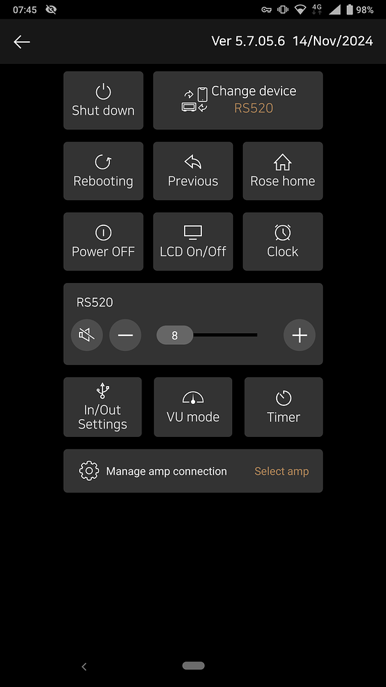
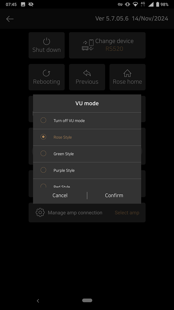
Clock & VU MEter selection in Android App different. Why?

The VU Meter and Clock selection are different and i do not see why.
Perhaps the GUI should have the same look & feel?

Clock can be selected and changed simply by push of the button.
Selecting the VU Meter a pop up with possible selection appears and needs to be confirmed.

If there is not a very large selection to choose from i somehow prefer the push of one button and the last one should switch off the function again.
The same procedure for selecting a VU Meter…

YES? NO?

@Ben

In the case of Vu meters, the type of Vu meter can be explained with colors, but in the case of Clocks, it is not possible to give names to each Clock.
Even if you give them names, users do not know which Clock they are.
So, in the case of Clocks, we set it so that they can be changed by pressing them.

OK i understand.
I just thought that simply pressing a button to cycle through options would be simpler on the RCU and GUI as well.