Rosehan,
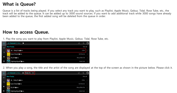
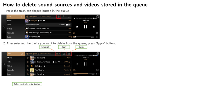
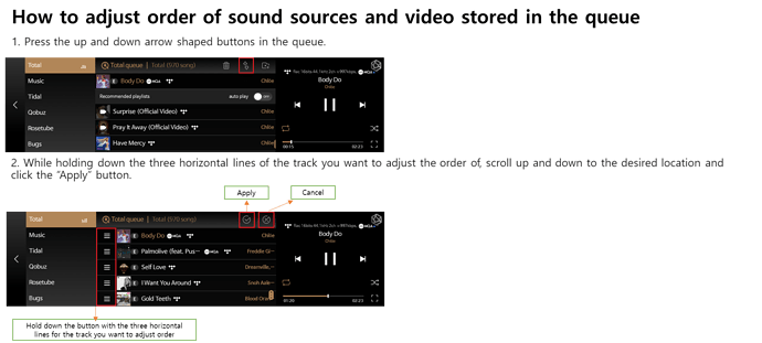
If I’m correct, modifying the queue list must be done by first accessing a song and then from that screen selecting the queue where the queue can be modified in various ways. This is not intuitive. Because the queue list is the central focus of the software, accessing the queue list should be one of the first items a user sees. I suggest that the major focus of the Rose Software is to aggregate access to various music services’ playlists. It does this well but accessing this function needs to be in the top level menu.
Consider putting the queue list symbol (three lines and a note ) at the top of the list of icons representing the various services whose playlists are integrated, i.e., Apple, Qobuz, Music, etc. Also please consider highlighting it by color or size to draw attention to it.
Secondly, a users list of playlists (This should be called My Playlists) that he has created are the first thing he returns to for listening to music. A new icon (My Playlists Icon - MPI) should be on the main page and should be the second item in the list of music services right after the Queue list icon. Selecting the MPI should take the user to the existing My Playlist(s) screen which shows all of the user’s Playlists and allowing the ability to Play, add, delete or modify playlists and their contents. I believe the current system requires a user to start a music listening session with the queue rather than a playlist. Many times however, a user will want to start listening with one of his previously created Playlists which are listed in My Playlist(s). For an example see Roon’s “My Playlists”. I think their arrangement is done well. I’m using (s) as the term you are using “My Playlist” is incorrect. It should be “My Playlists”
Making these changes to the Rose Software would greatly improve the user experience.
Thank you.
Ron Compton

