
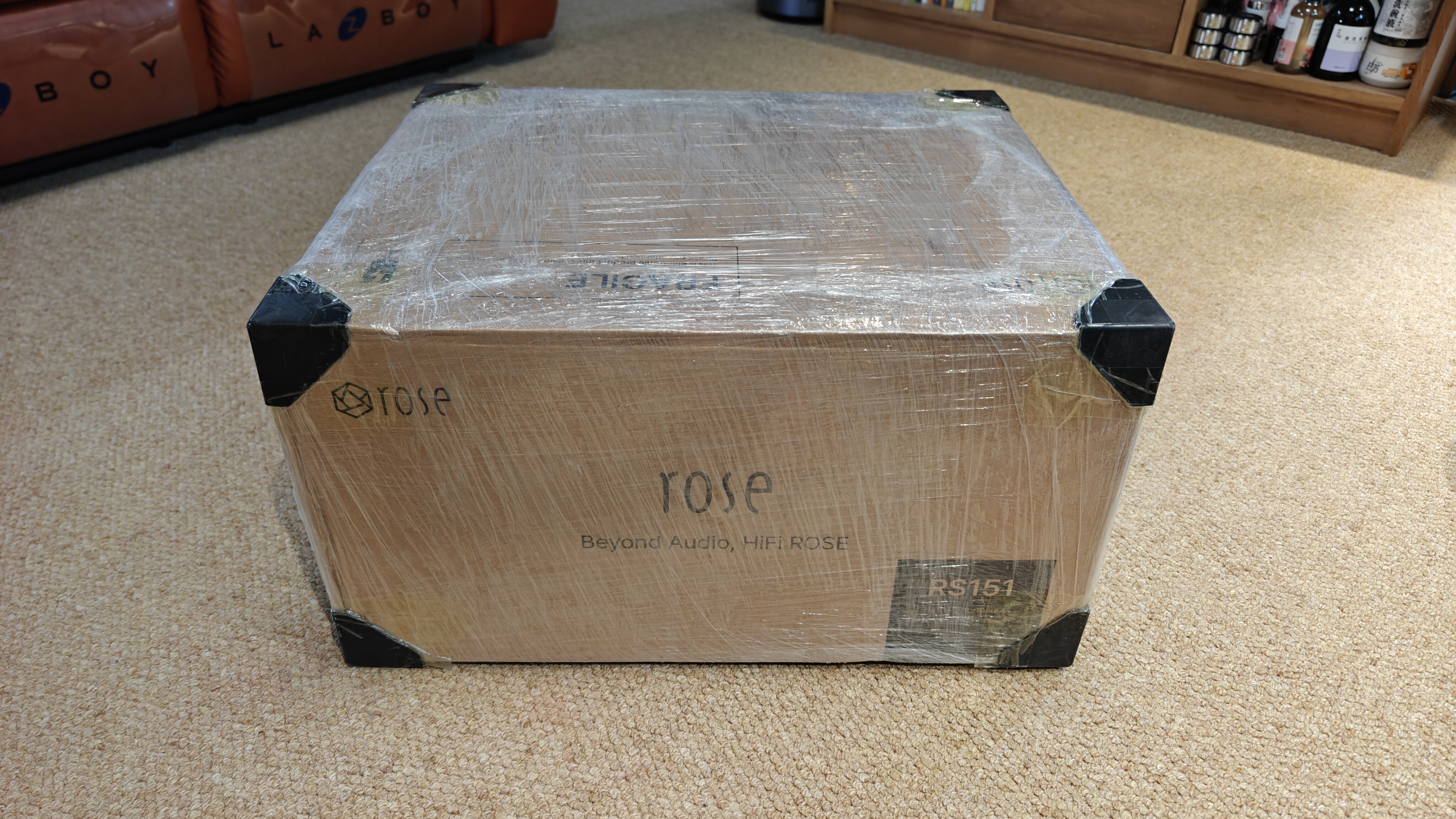
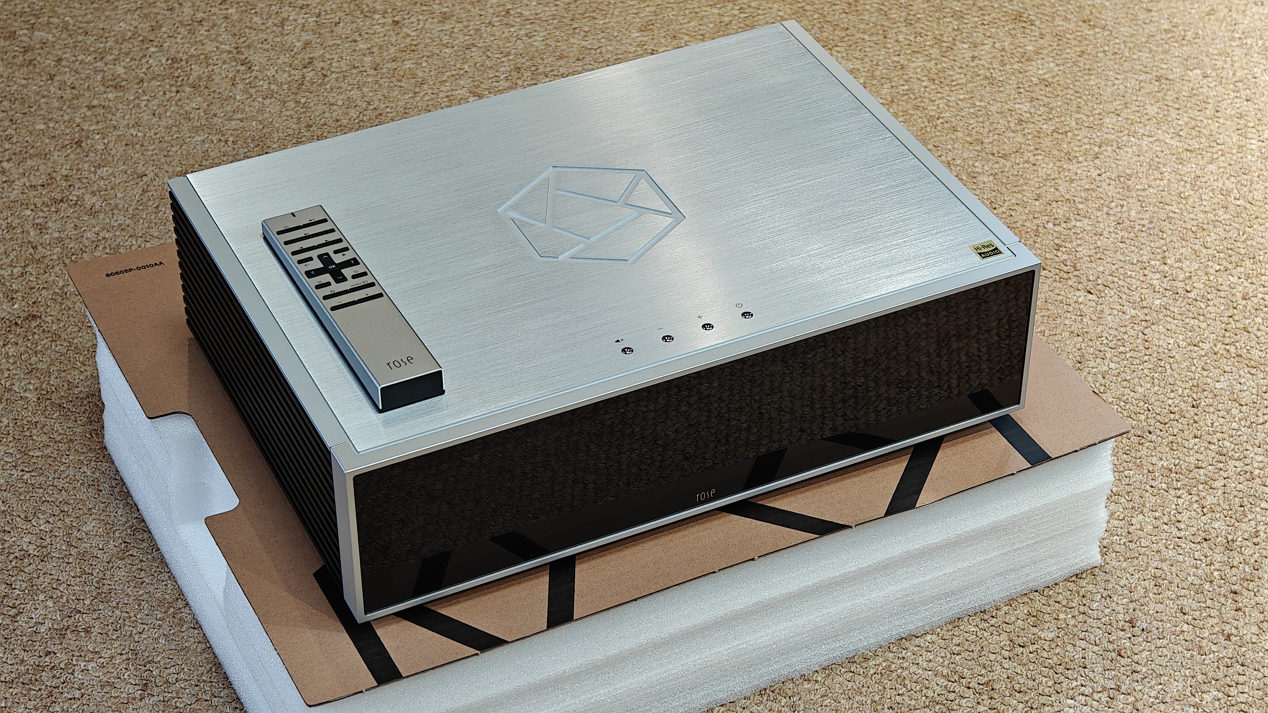
The overall workmanship of RS151 is great, and the appearance is also very beautiful. The only drawback is that the cutting edge of the top plate is very sharp.
The initial listening of the new device has delicate and transparent sound quality, good extension at both ends, sharp dynamics, and full low-frequency elasticity. Of course, I hope the sound can become smoother and more natural after ‘Run in’.
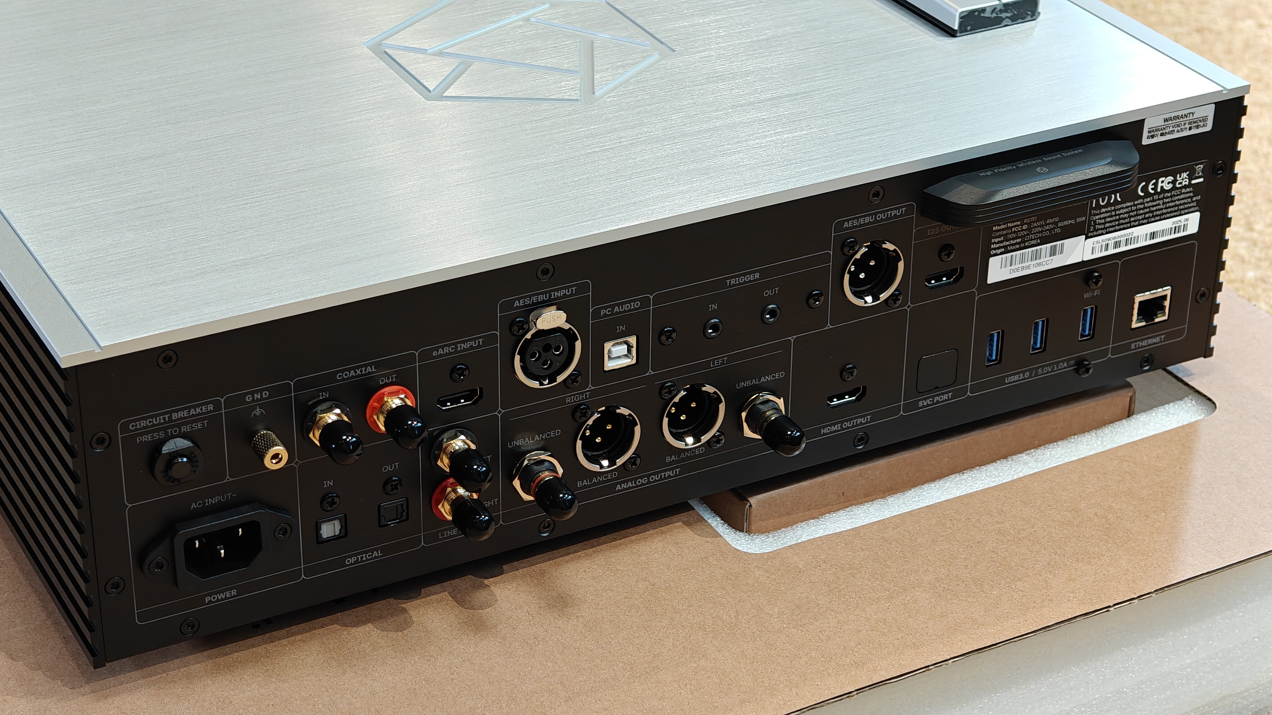
There is a regret in terms of the hardware interface of the body, as it lacks an extremely important output port in the network era: SFP (Small Form Pluggables). SFP ports transmit digital audio through optical fibers or electrical signals, and their core advantage lies in reducing electromagnetic interference and signal attenuation. It can isolate high-frequency interference from switches and front-end network devices. If using ROON core machine with RS151 as a bridge, the existence of SFP ports is very necessary.
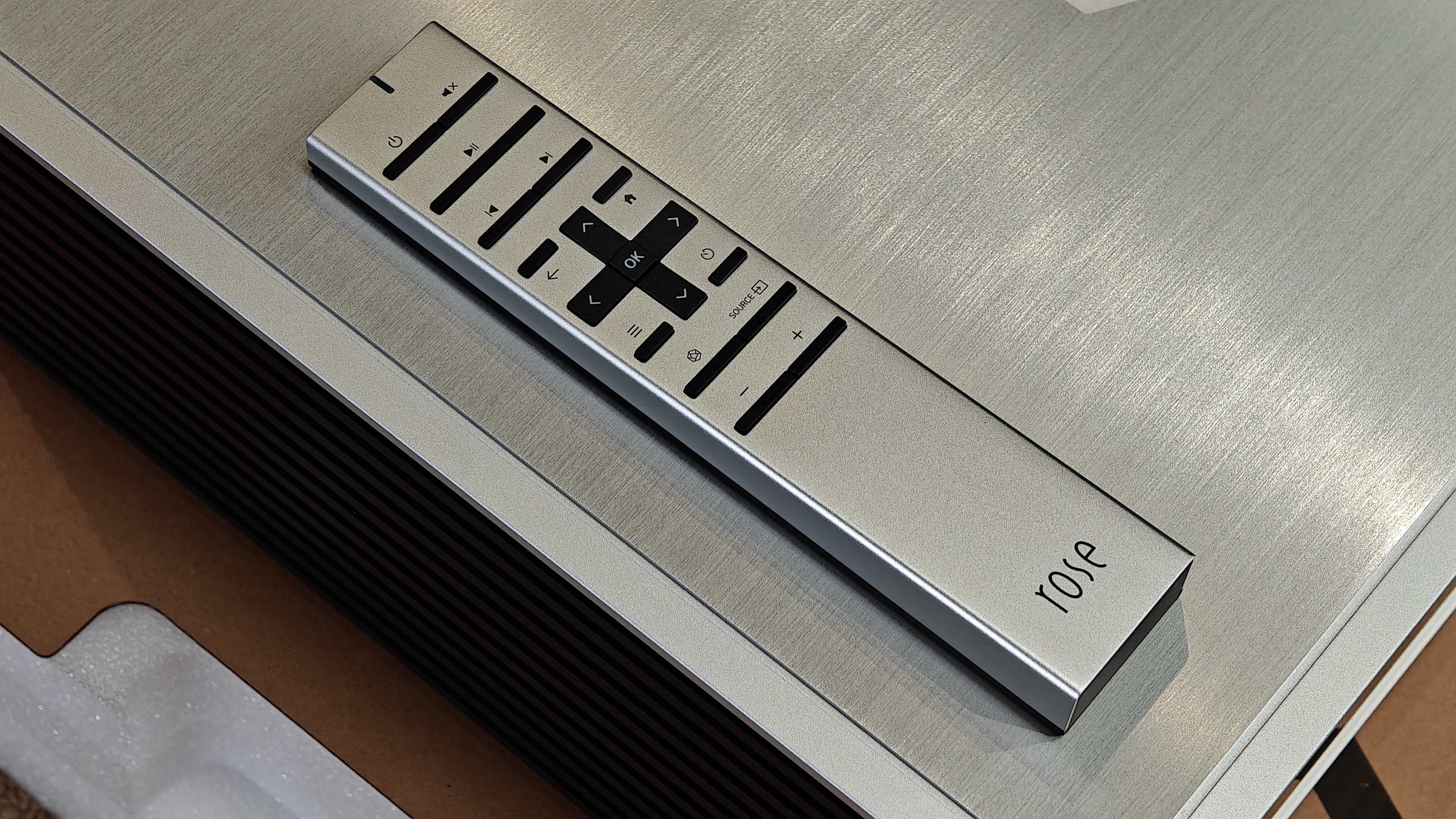
Next, let’s talk about the software control of iPad APP. The overall experience is that the operation is quite cumbersome, not intuitive and user-friendly enough. My current main playback source is a 3.5-inch 8T mechanical hard drive with USB external linear power supply. My previous digital broadcast was LUMIN U2MINI, and its app controls were very simple and intuitive, with extremely convenient song selection. HIFI ROSE should learn this well. The RS151 song selection lacks the extremely important icon based folder selection method. To accurately find the music files I need, I can only use the folder exploration list file selection method, which cannot see the album cover and affects the intuitiveness of song selection. Although RS151 has multiple album cover selection interfaces, the logic is confusing and it is extremely difficult to quickly find specific songs. (Without using the search function) Although there are horizontally scrollable music folder names on the music folder interface that can be directly clicked, it does not support multiple layers of folders. I mixed all the songs and albums that I had originally classified together, and some even split one album into two albums.
Key points:
1: We need a concise and clear icon based folder selection interface like the LUMIN system.
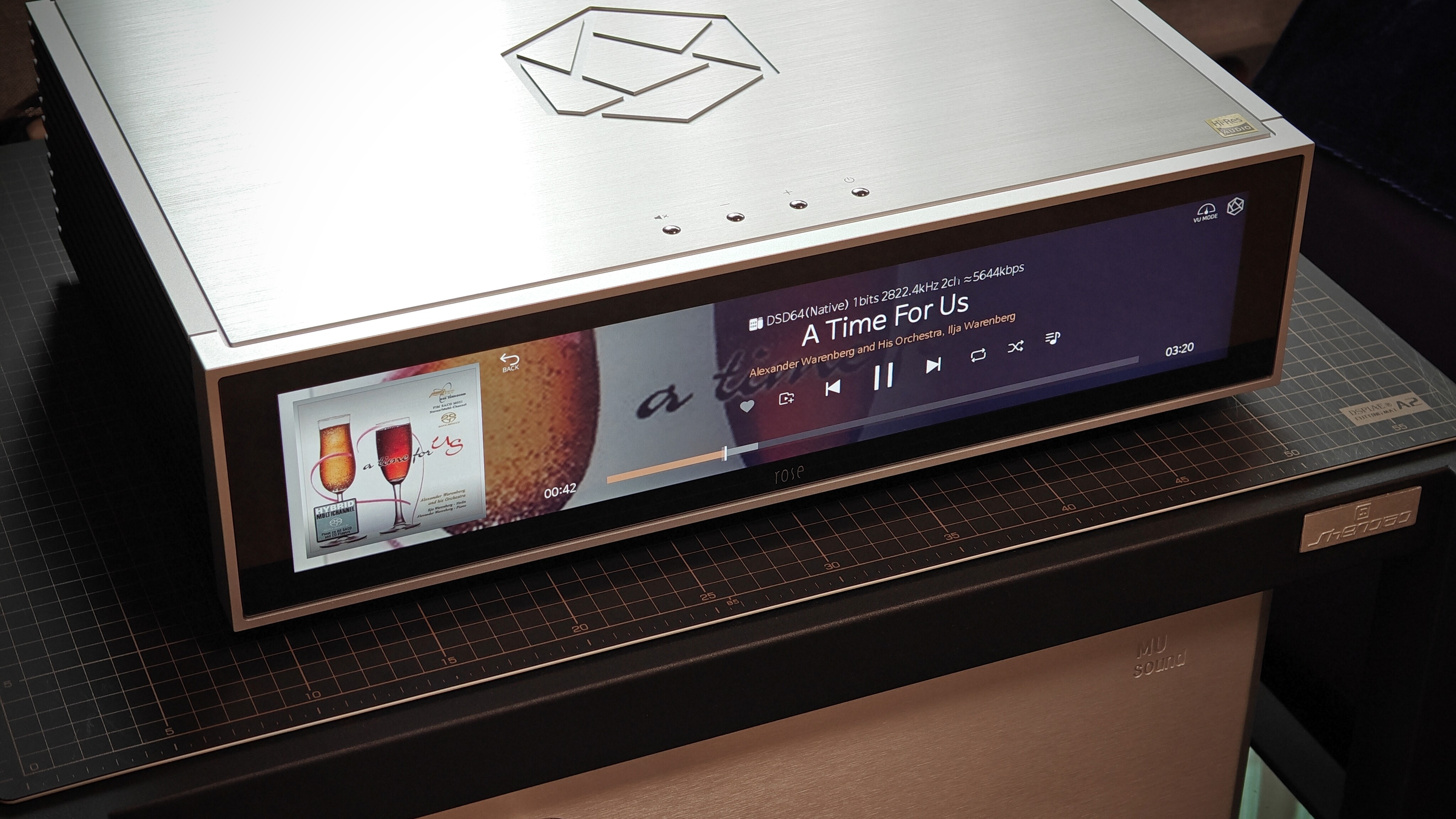
2: We need a more user-friendly playback control interface. Currently, the playback control interface consists of a huge album cover in the upper left half, song progress and control buttons in the lower half, and file information on the right side. And the song list can only be seen by clicking on the right sidebar. There is a bug here. The currently playing songs in the song queue on the right are highlighted, but clicking on other songs in the list can successfully select songs, but the songs will not be highlighted. You must close and reopen the right sidebar to see the song being played highlighted.
The UI for this interface is recommended to be designed as follows: the upper left half displays various information about small album covers and songs, audio formats, paths, etc. The lower half still includes music progress and control buttons. The right side is used to display the song list of the album, supporting operations such as clicking and switching, and supporting scrolling up and down of the list. Cancel the sidebar on the right.Of course, the left and right areas can also be interchanged to see which layout is easiest to manipulate.
There are two more points. Firstly, I hope to be able to zoom in and out of the entire album icon interface in the icon based folder selection interface, similar to the LUMIN system. 2: Long press a certain album icon to pop up the album playback mode, instead of needing to click on the album cover and then select the button to choose the playback mode.
Finally, I sincerely hope that HIFI ROSE will continue to improve. I really like the appearance design and sound quality of RS151. What we urgently need to improve is a more concise, intuitive, and user-friendly operating experience.


