Please explain the "Library" display screen

@ROSEHAN @Rose_Phil

Please explain the contents referred in each colored box

  1. I’m assuming
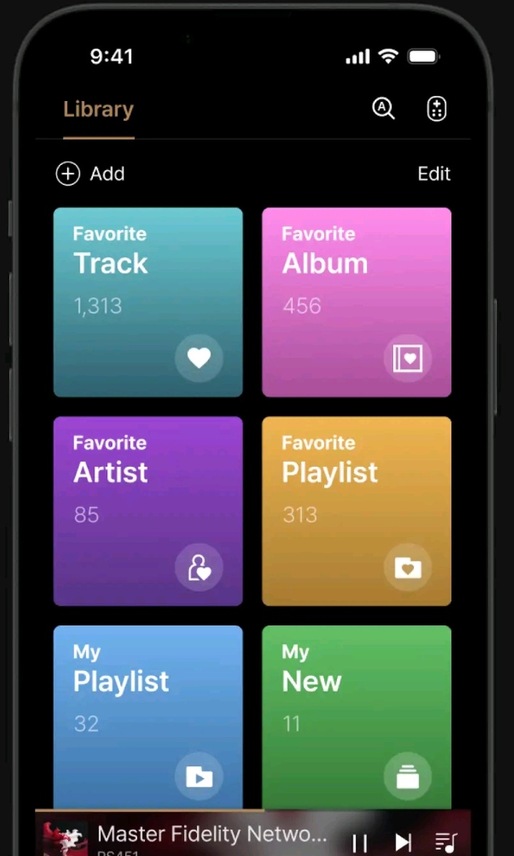
    a) Favorite Track (with 1,313 tracks) are tracks marked with the “heart” symbol on
    b) Favorite Album (with 456 albums) are albums marked with the “heart” symbol on
    c) Favorite Artist (with 85 artists) are artists marked with the “heart” symbol on
    d) Favorite Playlist (with 313 playlists) are playlists marked with the “heart” symbol on
  2. describe the difference of Favorite Playlist (with 313 playlists) vs My Playlist (with 32 playlists)
  3. describe My New

BTW, Change:

  • “Track” to “Tracks”
  • “Album” to “Albums”
  • “Artist” to “Artists”
  • “Playlist” to “Playlists”
  • “New” to ???

Question: What can user do when “edit” is selected?
Question: What choices are provided when “Add” is selected?

Reccomended change: Shorten the colored boxes to the 3 line height (move the bottom line’s right-most symbol to be on the 3rd line’s right-most side.) ← this will provide room for more colored boxes, a full 2 line currently playing panel at the bottom of the screen, etc

1 Like

Joyofmvid,

Me too. I would love some instructions about how these categories were defined.
This is an entirely new screen for the software.
Maybe a Youtube video about how it functions wouldn’t go amiss.

StandardModel

:clap:t2: :+1:t2:…+Minimum 20 characters.

1 Like

@joyofmvid

improvement proposals with our software team. They will review them—while the text changes are likely to be updated, any layout improvements will be implemented only if they determine internally that such changes are necessary.

“Favorite Playlist” refers to playlists that have been added to favorites by selecting the heart icon from existing playlists.
“My Playlist” refers to playlists that you have created yourself.

“Add” allows you to create new folders such as “Favorite Track,” “Favorite Album,” and “Favorite Artist.” This enables you to organize and store selected items separately from your overall Favorites. For example, if you have 1,000 tracks in Favorite Track, you can create a new folder and move 50 selected tracks into that folder.

In the screenshot you provided, “Edit” is used to reorder or delete the folders you have created.
Individual folder editing can be done after entering the folder.

@ROSEHAN

  1. What is “My New”?
  2. If I select Favorite Tracks, what happens? ← is a new display shown with a scrollable list of tracks with each track shown witn an “Album thumbnail” in front and with play/pause icon, play next icon, queue icon & a vertical 3-dot icon
    • in addition, is a BACK display button shown to go back to the above post’s image
  3. if I change the Function to “Music”, I assum I’m back to the normal Rose One UIF ← is this correct?

@joyofmvid

The Library screen in the ROSE ONE app has been updated as follows:

  1. “My New” has been changed to “My Feed.”
    ‘Feed’ is a space where you can upload photos and posts to share with other users. Through the Feed, users can easily exchange opinions on various topics, including sharing playlists, audio news, and discussions about musical instruments.

  2. When you enter “Favorite Tracks,” the tracks you have marked as favorites will be displayed as shown in the image.

Yes, a BACK button is also provided so you can return to the previous screen.
3. To return to the main ROSE ONE UI (home screen), please select the HOME icon at the bottom of the screen.

Rosehan,

I am ecstatic over the frequent corrections and updates. Keep up the good work. May I suggest a YouTube video explaining the Library functions wouldn’t go amiss.

StandardModel

@StandardModel

We are continuously working to improve ROSE ONE and are making ongoing updates and fixes.

Features such as the Library are still being actively refined, so creating a YouTube video at this stage could potentially cause confusion for users as changes continue to be made.

Instead, we have uploaded several FAQ-related videos on YouTube.

If you have any specific questions, I would be happy to assist you.

Rosehan,

That’s a fair point. I’d much prefer updates to explanations.

StandardModel

@StandardModel

We are continuously releasing updates to make the ROSE ONE app as complete as possible.
We will always do our best to improve.

@ROSEHAN

  1. A couple of suggestions, for the back icon put a rounded edge square around the ← symbol… (A lot of newbies don’t realize this is the back button). Also, consider making the left arrow, a 3-dimensional left arrow.
  2. Change “Track” to “Favorite Tracks” ← font to be the same color as the Library Function color
  3. What is “Delete” ← what does this apply to & what does it do?
  4. On the image’s next line is a “2 line” icon? Is this the 3-vertical line equalizer icon? If so change one of those icons to be consistent
  5. I don’t understand the role of “All Music” ← if this is a button to switch to “Music Favorites” then put “Music” & “Video” 3-dimensional buttons on the note #9’s “List Header line” ← put " || " after the “(5156 items)” & on the left of the right-most icons. If there’s insufficient horizontal room, make the List Header 2 lines. The currently selected Music/Video button to be sunken with the Music/Video word on a light gray background color & the word’s font to be the same color as the Library Function color
  6. change the magnifying glass followed by “Please enter a search term.” to the “standard magnifying glass with a A” icon & place this icon on the left side of the remote control icon ← be consistent
  7. move “5156 Track” to be on the left of “Favorite Tracks” (see #2 above) and should be shown as " (5156 tracks)" or “(5156 items)” ← show this in the same color as the Library Function color
  8. what is “up/down arrow icon with Latest registration order.” about?
  9. it’s difficult to realize the “Play & Shuffle” are buttons. Consider creating a List Header line (ie. an outward circular line above the list) and place “:twisted_rightwards_arrows: :arrow_forward: followed by Play Next icon & the Queue icon” on the right-most side of the List Header line. Also consider moving note #2 & #7, to the left-most side of the ?ist Header line.
1 Like

@joyofmvid

  1. Based on the design direction we are pursuing, we will not be changing the left arrow icon. We reviewed this internally and concluded that making the left arrow 3D or keeping it as it is does not change the meaning of the icon.
  2. I have already requested that not only “Tracks” but all relevant terms in the Library be changed to plural forms where appropriate. We currently have many requests and revisions in progress, so I would appreciate your understanding that this may take some time.
  3. Which “Delete” are you referring to? I am not sure where you are asking about the meaning of “Delete.” Please explain in more detail.
  4. Which “two-line icon” are you referring to? Please provide a more detailed explanation.

5, 6, 7, 8. Please let me know where those phrases or icons can be found. In order for me to give you an accurate answer, I need a more detailed explanation of where exactly those icons are located.