Hello, I would like to share some remarks about the graphics while ripping.
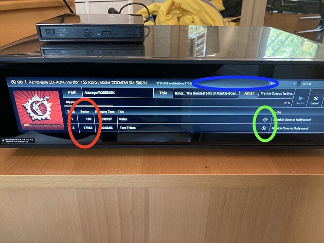
1. Red circle: I was wondering why displaying the sector number? I don’t see the added value of that, but maybe other people do? If not needed, better not show it and use this space for the track name + artist name.
2. Blue circle: I suggest to move the ‘Ripping’ status bar to this open space, so that there would be space for showing an extra track on the initial screen (showing then a total of 3 tracks instead of 2 currently).
3. In addition of point 2. it may be interesting for some people (me included  ) when the top 2 horizontal lines (‘Path’ and ‘Track’) could remain always visible when scrolling down the list of tracks instead of disappearing like now is the case. This could be set as ‘fixed’ or ‘variable’.
4. Green circle: After a track is ripped, a ‘Play’ button is shown completely on the right of the track title. First of all, what is the purpose of it? Secondly, personally (maybe because I am left handed?) I would prefer a position much more on the left, like left of the ‘Track’ number column or left of the track ‘Title’.
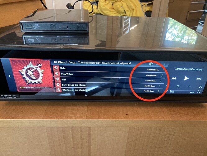
5. Green circle above/ red circle below: I noticed that the space for the ‘Artist’ column is quite limited. Here the name is shown completely but in other screens like when after finishing the CD rip, it is not the case:
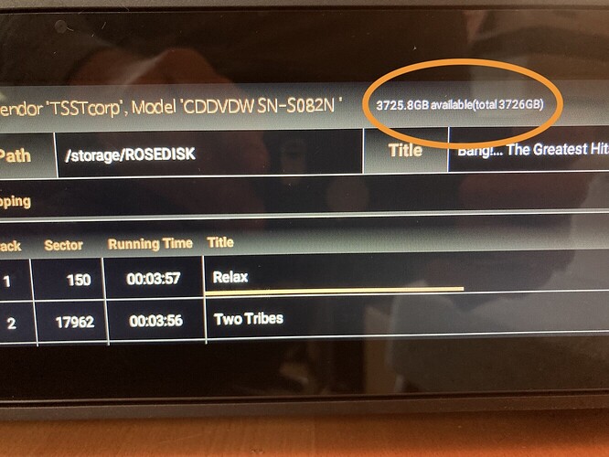
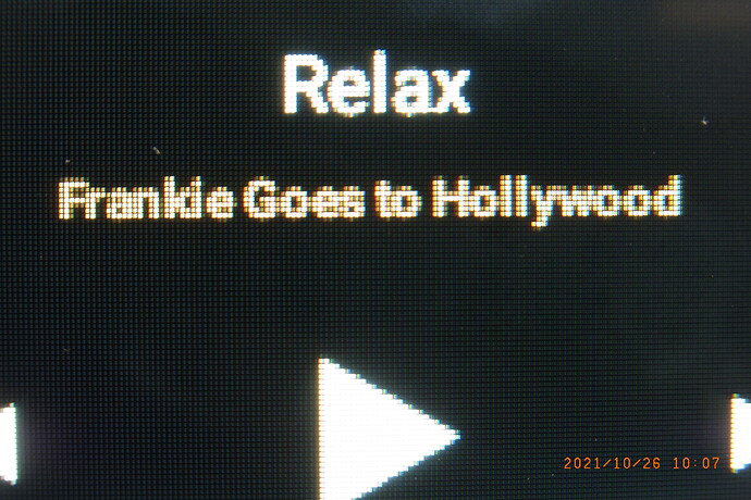
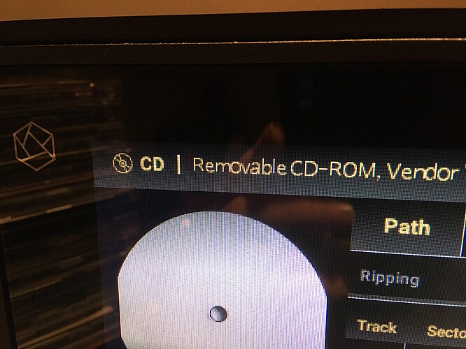
6. Quality of display: I am disappointed about the readability of text on the display. The letters are not fine focused, so I am wondering if there is a problem with my device or is this the standard quality? Look here for example in the orange circle:
The smaller letters are almost glued to each other, diminishing the readability importantly. And notice how strange the characters of the CD-ROM are displayed, some are bigger than others.
Thanks for your feedback.

