Hello to everyone reading this comment.
I intend to contact the engineers at HI-FI ROSE, which are responsible for developing and writing the Rose Connect Premium app. The USA representative told me to write in this space to be heard by the manufacturer.
I can write based on my experience using several high-end streamers from high-end brands.
I use a high-speed wired Ethernet connection, and the app is installed on an Android S9+ tablet running Android 14 and One UI 6.1.1.
Please, HI-FI ROSE, address these points, which are vitally important for managing the music we listen to through the app intuitively and enjoyably:
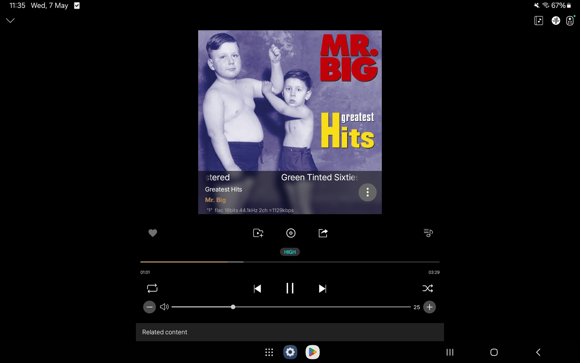
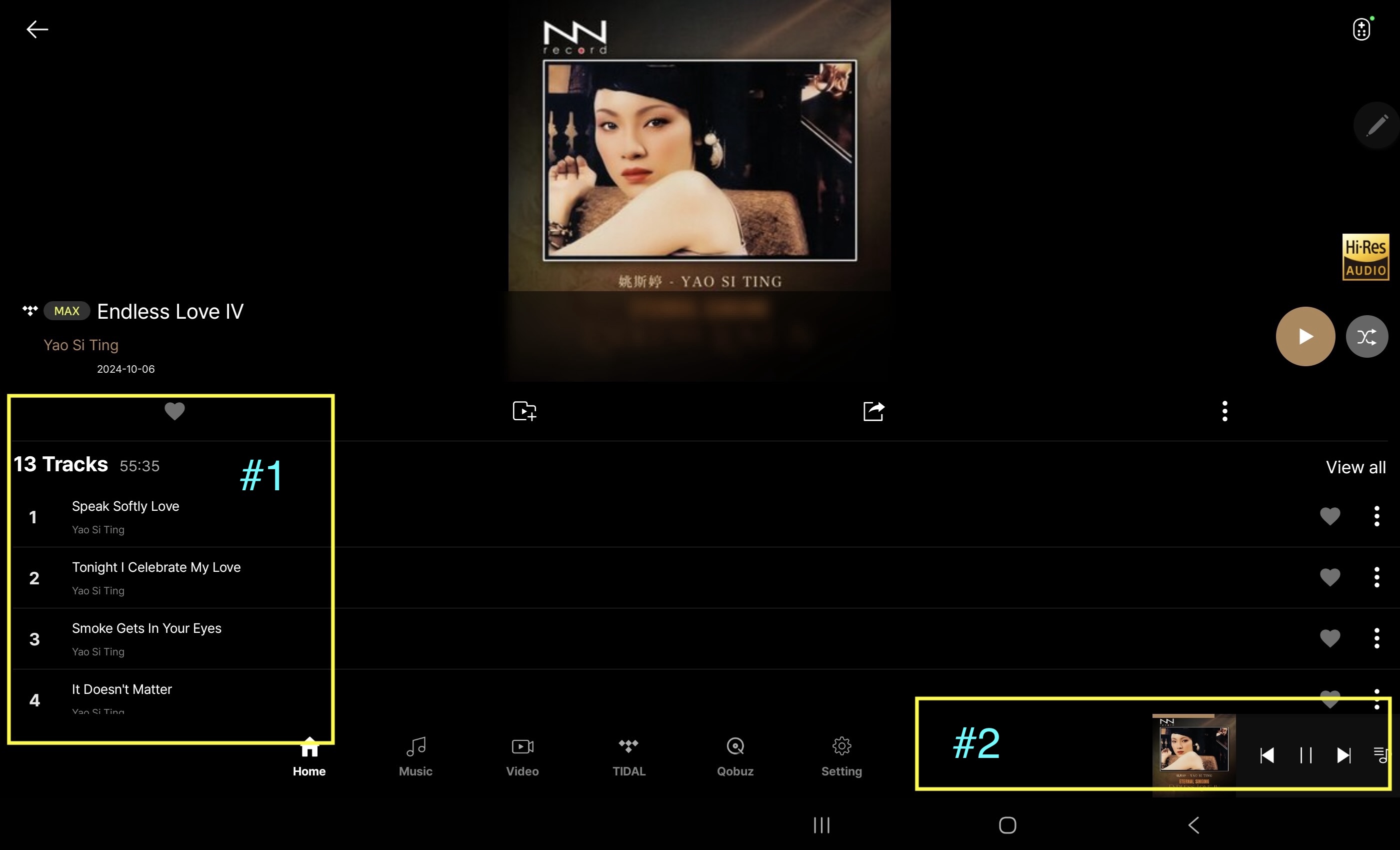
- The track we are listening to should have a moving green bar, circle, or dot in the tracklist, indicating it is playing.
- The currently playing track window at the bottom of the screen should display the track name.
- The option to automatically detect and switch from internal streaming to optical, analog, coaxial, or USB should be available. The system does this from any external input to the internal input but not from the internal input to the external input.
- After a couple of hours of use, some tracks disconnect and reconnect.
- Offer the option to change the background color.
- Offer the option to enlarge the font size.
- Offer the option to customize the app’s bottom menu.
- Offer the option to rename and assign symbols to input devices connected to the streamer. EXP: On the optical input, renamed to CD player or DVD player.
- It would be great if the radio app allowed US customers to access Sirius XM.
- The registered model should appear in the device’s input/output settings. I have the RS250A, and the input/output settings show RS250.
- When connecting to AirPlay, there is sometimes a popping noise. The app doesn’t show that AirPlay is in use or connected. The connection is active and producing sound, but there is no description of it.
Thank you to all community members, and a very special thanks in advance to HI-FI ROSE for listening and providing this list of improvements to all users.
Best regards!