The Decision Tree needs to be improved

Please forgive this long post.

I’m going to give an overview.

First, I love the Rose products. I’m a “fan boy” of the first order. That however means that I want Rose to be the best product of its kind on the market.
My comments here in no way are to be interpreted as a criticism of Rosehan and the other moderators as they are doing their best and do a great job which is very much appreciated.

The hardware: It’s superb. Nothing is better. I’ve now owned four Rose products and the hardware is of the highest quality and excellent in every way.

The software: The concept of combining audio and visual is ahead of its time. The software is reasonably quick, stable and does not crash.The graphics are wonderful. The Rose device and RoseConnect screens are beautifully done. So what’s the problem?

The decision tree for the screens is terrible. There is no other way to say it.
Why?
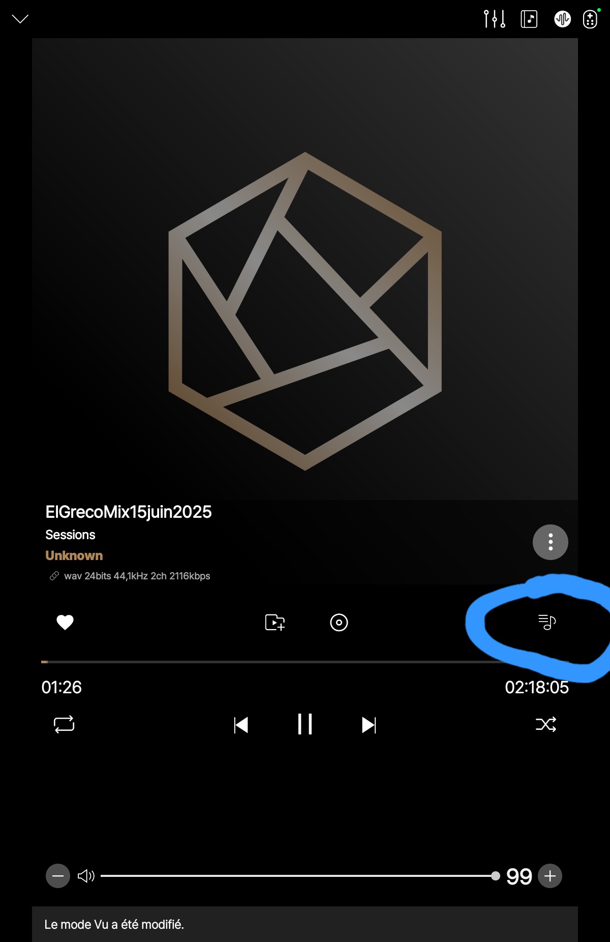
To answer this question one must ask what is the goal of the software. I would submit it is first and foremost to make it intuitive for the user who is an audiophile- not a programmer- to get to a place where the desired music can be played/displayed with as few keystrokes as possible, ideally none. I’m calling that screen with the full audio and video the “Main Screen” because I can’t find its name in the manual.

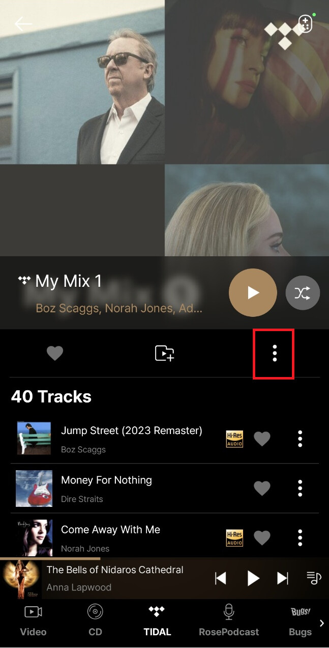
For an example of how not to meet the good programming standards take RoseConnect. Its opening page which cannot be changed is RoseNew which has a choice of music from unknown people and nothing from the user- not even content curated for the user’s taste. In choice ranking that choice would be dead last for most everyone. Most people would want to start with MyPage because that’s the obvious place most people would want to go most of the time. My page? sixth and last choice. Did the programmer give the user a choice? No. Bad programming. This is an example of more keystrokes than necessary being required to get to the Main Screen to play the user’s desired music/video.

Take another example RoseRadio. You see your favorite recently played station. You want to play it so you touch its icon. The screen then changes to the Main Screen and the station then plays with Shazam video, right? NO it doesn’t. What happens is that the station plays but you are not taken to the Main Screen. Instead, you are left on the same page but there is a tiny icon of the station in the system tray.
Bad programming. The user has to intuit that it takes another press of the tiny icon to get to where he/she wants to go, the Main Screen. This doesn’t meet the goal of getting the user to where he/she wants to go with the most intuitive and fewest keystrokes. My RoseRadio? Same thing. You are not taken to the Main Screen.
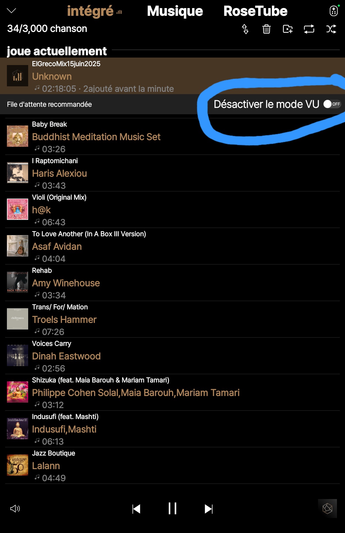
Suppose you need to add a cache. Where are its enabling settings? In
RoseTube, of course. Intuitive? Fewest keystrokes? No, no.

Take the Queue. you see a song in the Queue you want to play. You click/touch it. does it take you to the Main Screen and play the song? No. That is true even if you select “Play Now”.

On RoseConnect if you start with Music and want to play an album, if you press on the song title, a tiny icon of the song’s cover lights up in the tray. Does this play the song? No it takes you to a screen which is half Related Contents and half of the Main Screen. Can you then swipe right on the Related Contents and hide it as you can with other split screens revealing the whole Main Screen? No. So how could you have gotten directly to the Main Screen from there? As far as I can tell, you can’t. It’s a dead end. As far as I can tell, it’s impossible to get to the main screen from anywhere in the RoseConnect software. Please correct me if I’m wrong as this is hard to comprehend. Why is this important? Well, just for one thing the abbreviated Main Screen cuts off some of the options like access to the queue which is on the MainScreen. Another nit in the Related Contents screen: Why only here does one have to press the “down carat” to go back a screen? Why not a “left carat” again to be consistent.

I could go on but I would just be repetitive.

It wouldn’t take a great deal to fix these issues. In fact if the beta versions had been timely released to the user group I’m confident that most of them would have been identified for correction. Please consider fixing these decision tree complications to simplify and make selections intuitive. It will make a great product even better.

StandardModel

18 Likes

Very nicely said StandardModel!!

I saw a lot of posts asking for the same changes, including 1 from myself.

But you explained it so very clearly that it should be understood and therefore changed :+1: :+1: :+1:

Btw I switched to Roon because I could not take the Rose software anymore. This also means that I am thinking of other streamers. Like the Silent Angel Munich MU for example. I am thinking about testing it in the near future. This is how fed up I am with this subject.

Thanks again for another attempt to make the Rose products the very best they can be!!!

Merijn

3 Likes

I completely agree. These are a bunch of simple things that ought to be easily implemented and would massively improve usability.

I’m pinning a lot of hope on the update provisionally scheduled for Q4. Given this will need a restructure of the underlying database I hope they take the opportunity to address some of these configurability and usability issues.

2 Likes

I try, really I do, to use the Rose app, but it’s dreadfull. If I choose a song to play, why do I need to press the icon to take me to another screen to control that song?

It’s just a basket of kluge. I own 2 RS130’s. The hardware is brilliant. Can you please create softwarte that is brilliant to?

Thankfully Roon is alive and well.

3 Likes

I totally agree with you and spoken well. I work in the ATC software industry and see the same happening there. Its the programmers implementation and not the customers. Technical requirements versus HMI requirements. Command promt versus usability. The first one is home for the technicians and perhaps some audiophiles. The latter is your end user. I cn deal with a command prompt style interface but my wife and kids can’t. Thats the basics and seemingly hard to communicate to an engineering team because the interface is completely logical, rational and usable in their opinion. Its a magical piece of hardware with a fantastic sound but please please make it end user friendly ! @ROSEHAN and collegues, please leave your technician bubble.

4 Likes

Very good item, I agree for 100%!!!

HiFi Rose as well as Eversolo are excellent streamers, DACs, preamps, but in both cases the software from a usability point of view is lacking. I have 3 streamers in different systems at home. Two DMP-A6 and A8 and one HiFi Rose and I control everything form Roon. From editing metadata to building playlists and scanning the library when you add something new, is light years from the software in those boxes. I believe improving them will need a complete rebuild from scratch. My advice: use Roon.

1 Like

An thoughtful and respectful article from a true fan of Hifi Rose. I have also used 5 products from Rose so I appreciate your contribution. Thanks a lot.

2 Likes

Very good points made. I’m coming over from 10+ years of Bluesound usage. A Vault, Node and Pulse mini. I was with them almost from the beginning and there were some growing pains but they continually improved the product and software.
I’m hoping that Rose will be the same way, but currently they seem to be slow with updates. When it comes to streaming it’s all about the sound quality and the user interface. As mentioned, way too many screen taps to get to where you want to be.
I loved the build quality but my 150B went bad with a flash and a smell of burning electronics. It’s currently out for repair under warranty but disappointing to say the least. Looking forward to getting it back so I can continue to learn how to use this wonderful piece of equipment.
I raved about it and the next day it went bad. Rose appreciated my kind words with a reply, but when I later mentioned the problem, no response at all.
When I had a problem years ago with my Vault, Bluesound was quick to respond and ultimately upgraded my original Vault to the latest version when it became available at no additional costs.
Rose, pay attention to how the competition doe’s customer service.

Pappaduke,

Well said. I don’t think its any surprise that you are seeing the very slow progress on updates. Many others have said the same thing as well. As I have said, HiFi Rose’s huge lead in combining video with software has been squandered by delay and mainland China companies (EverSolo and others in Shenzhen,) are producing something very close at a fraction of the cost of a Rose device.
While I appreciate new gear, the existing products must be properly supported. I’ve said many times that when software is up and running in a stable form, you have reached the halfway point in development costs. The other fifty percent of development costs is expended in making it intuitive, user friendly and polished.

StandardModel

1 Like

After a few weeks I came the same conclusion. Using Roon is instant solution and saves a lot of time and energy. Hifi Rose is a very, very good product but only in combination with Roon IMHO