
Are you still unable to add RoseTube videos to a playlist using your Rose account?
It does not appear that there is any issue with your account.
If you uninstall the RoseConnect app and then reinstall it, does the same issue still occur?
Hi, thanks, it seems to work OK now - it didn’t work last week so I don’t know what happened since the time you asked me to share with you my account details - but - in the end - I am now able to add tracks to playlists in RoseTube, thank you.
1 Like
The little puppet that shows all rosetube content by 1 author is missing 
We have recently made a minor update.
We will continue to release stable software step by step.
Could you clarify what you mean by the small icon (button) that shows RoseTube content?
Please provide a bit more detail.
1 Like
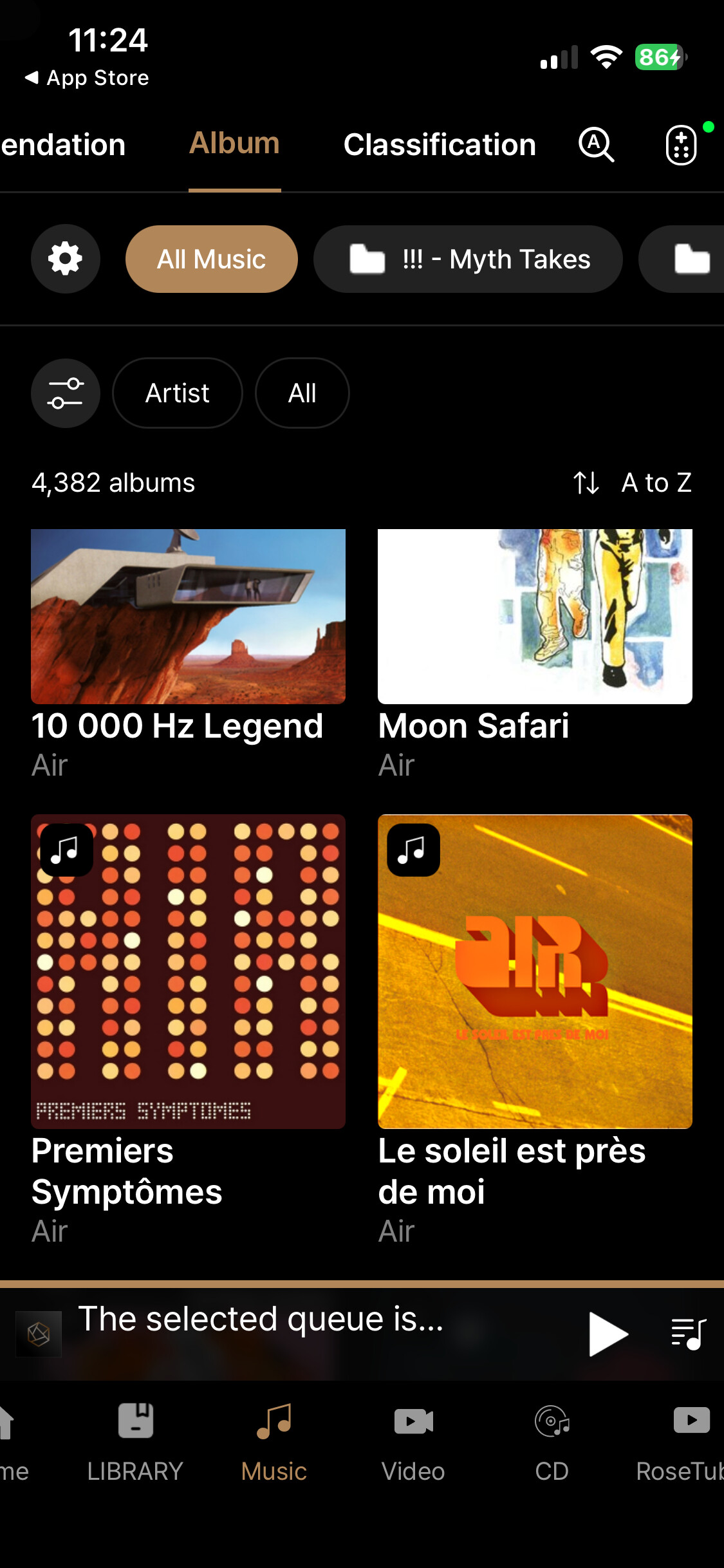
Why are the thumbnails on the album view so big?
Difficult to navigate in a big discography
Make the same size as on the previous application
2 Likes
Is there a limit to the number of tracks contained in a playlist folder when streaming via Rose One ?
Two of my playlist folders each contain 246 tracks and 583 tracks.
Since the last two updates on Rose One ( last one 1.0.14.1) both are unplayable on either Tidal or Qobuz. The screens of my iPhone and iPad simply freeze.
All other playlists, which each contain less than 100 tracks, play just fine.
There are no issues playing the two large folders when using Rose Connect Premium.
I have emailed videos to you showing the problem.
Couldn’t agree more. @ROSEHAN please consider making these smaller. Much easier to navigate and much cleaner/simpler look.
1 Like
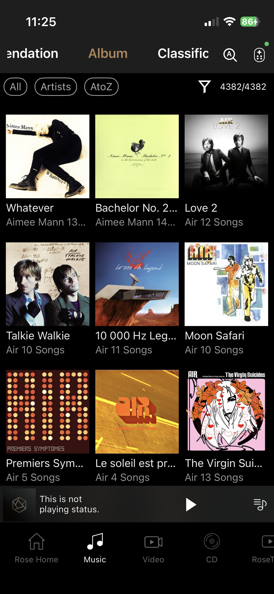
The latest version of Rose One released earlier today now has a “List view” for albums and playlists which makes scrolling and viewing a lot easier than before.
See screenshot

Nice one @Martini - but the point made here (and I suppose this is the same for @Gillesbonatti…but I shall leave it to Gilles to confirm…) is about how albums show up in one’s music collection.
Currently, I am using my iPhone, but i suspect this applies to users accessing their album collection on an iPad or else.
Here’s the view in RoseOne (1.0.14)
Here’s the same view in RoseConnect
Not mentioning here basic design principles, I suppose what we had in RoseConnect makes the view, access and navigation much simpler, particularly when you have a large collection.
N’est pas?
@ROSEHAN please consider.
1 Like
Apologies for my misunderstanding.
With the latest update to Rose One, a list view was finally provided. Prior to this update, my iPad was showing 4 thumbnails per row versus seven per row on Rose Connect premium.
The latest list view is a big improvement.
If Rose can provide a fix for streaming apps like Tidal & Qobuz, then one would hope they can do the same for the situation you are experiencing.
Why they couldn’t do both at the same time escapes me !
1 Like
hello Rose Team
I have 3 things in the old RoseConnect soft that i prefer over the new Rose One soft:
- Hearts are not visible
- Scrolling always returns to top of list
- No indication how many songs are in “Qobuz Playlists on Rose”
1 Hearts are not visible when browsing albums, recently played tracks, playlists, etc. In the old Connect the hearts indicating favorites were visible from the browsing view and now the user must click on the 3 dots to see if the heart is engaged. This makes it more cumbersome to find my favorites.
2 Scrolling returns to top when I am going through (for example) Qobuz Playlists on Rose. I am often scrolled many screens/pages down the list, then I select a playlist, and when I return to the list it returns to the top. This is inconvenient because I then need to scroll down many screens/pages to return to where I was.
3 No indication of the number of songs in a Qobuz playlist. When browsing I cannot see how many songs are in the playlists. Often I select a playlist and see it only contains several songs, so I return to the list…and then I am at the top of the large list because of 2 above so then I need to start scrolling down to get back to where I was.
All 3 mentioned above worked in the (my) preferred way in the old software and made the user experience more enjoyable. If you would like sceenshots for clarification I am happy to provide.
thanks for considering
2 Likes
Folks… This app is not an improvement. I have to do more clicks/swipes to get to the same places I could before, the album icons are now HUGE making navigation more time consuming, there’s a new “Library” button that seems to have no discernible purposes, and the the text icons in the nav bar include strange characters not represented at all in my collection (perhaps they are Korean?).
I’m not sure how you are doing user research, but this is not really a step forward.
I will say the one strong positive is I can now search for an album or artist and it limits to the media I own, instead of going out to the web.
Hmmm.
I’m using the mac desktop version… don’t really have the issues.
But then again I haven’t loaded up any music on the local hard drive that I installed.
It seems a bit more responsive than Rose Connect and I can easily set it up to switch input or to go thru Rose Tube I do think its a step forward, but still there are a lot more steps along the journey.
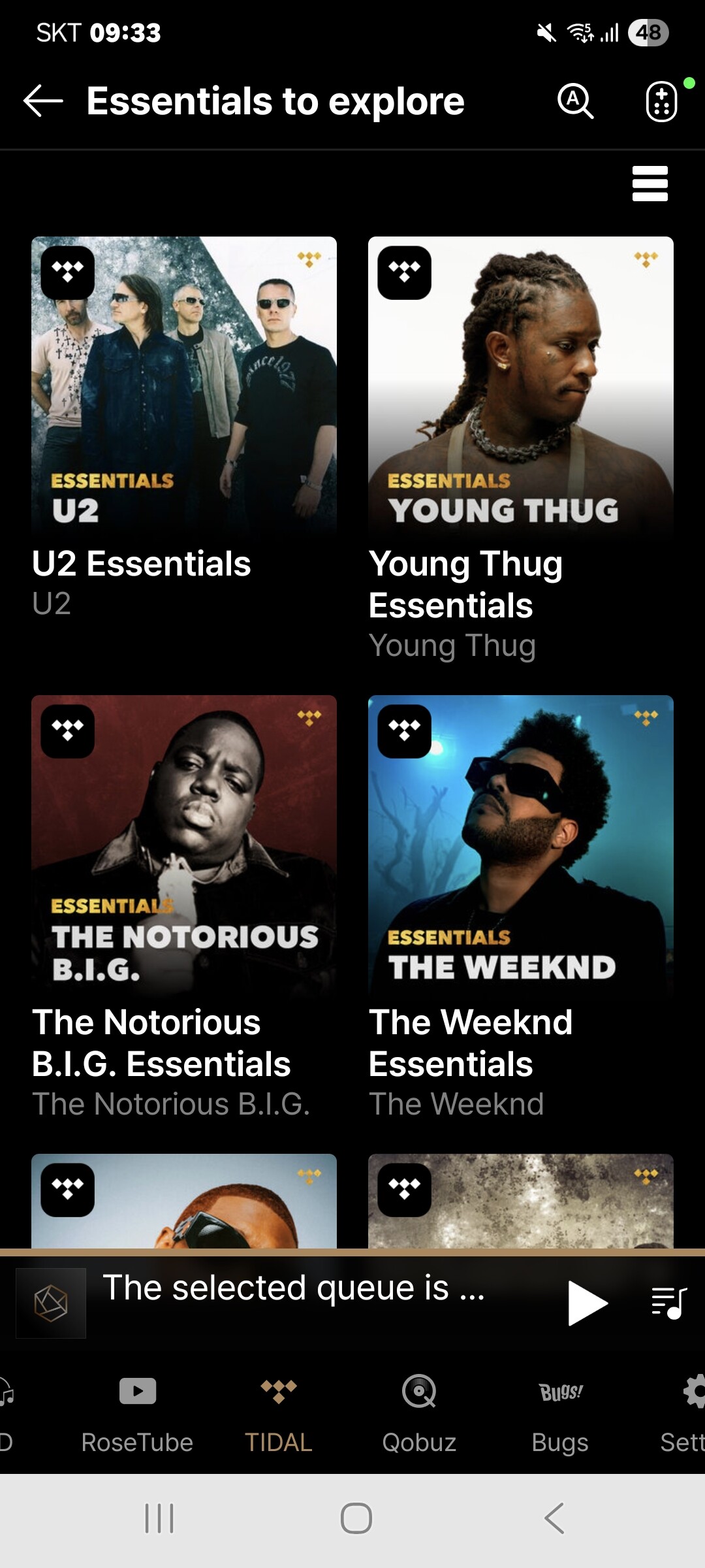
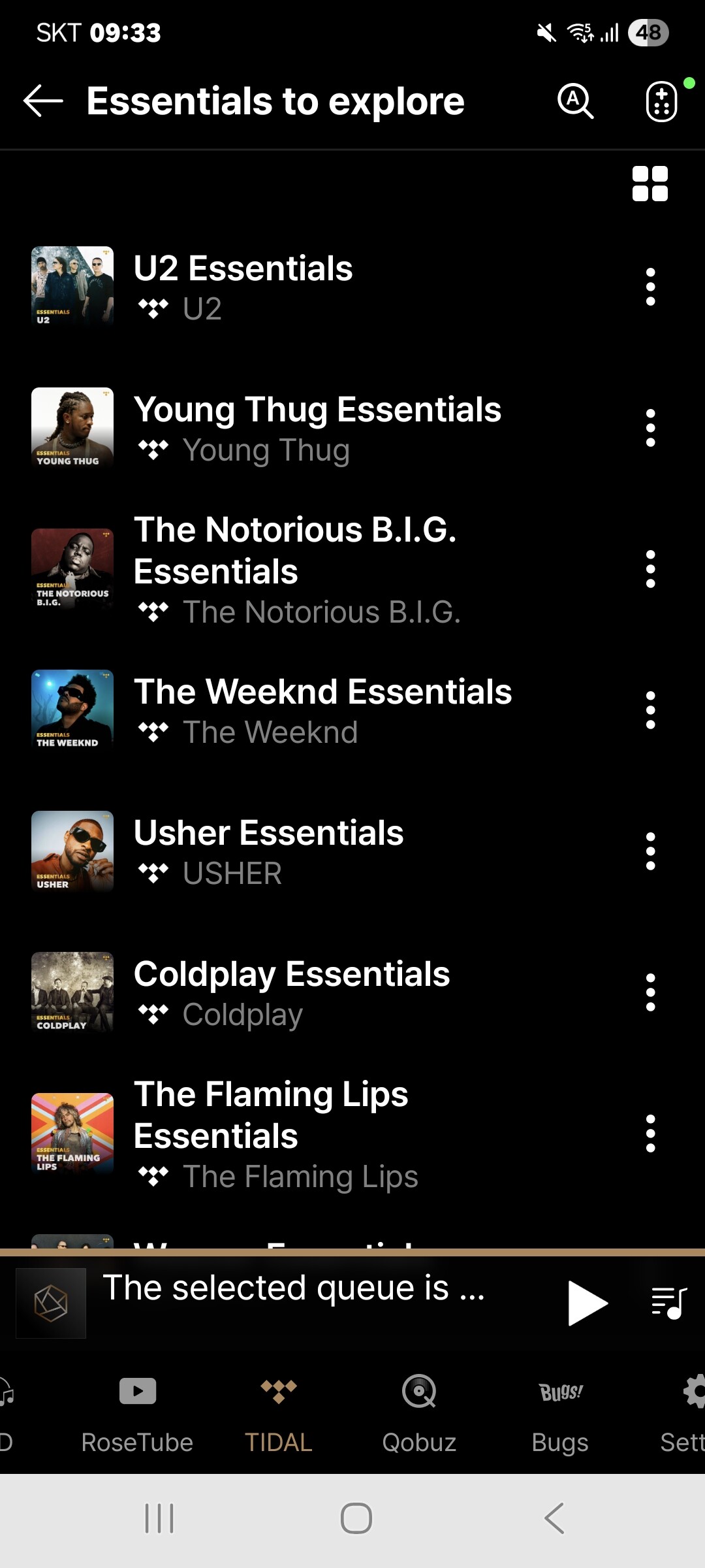
- As shown in the image below, you can change the view to a list format by selecting the “Change View” icon in the top right corner of the album list.
- Could you please send us a photo of the strange characters you mentioned? We will look into it as soon as we receive it.
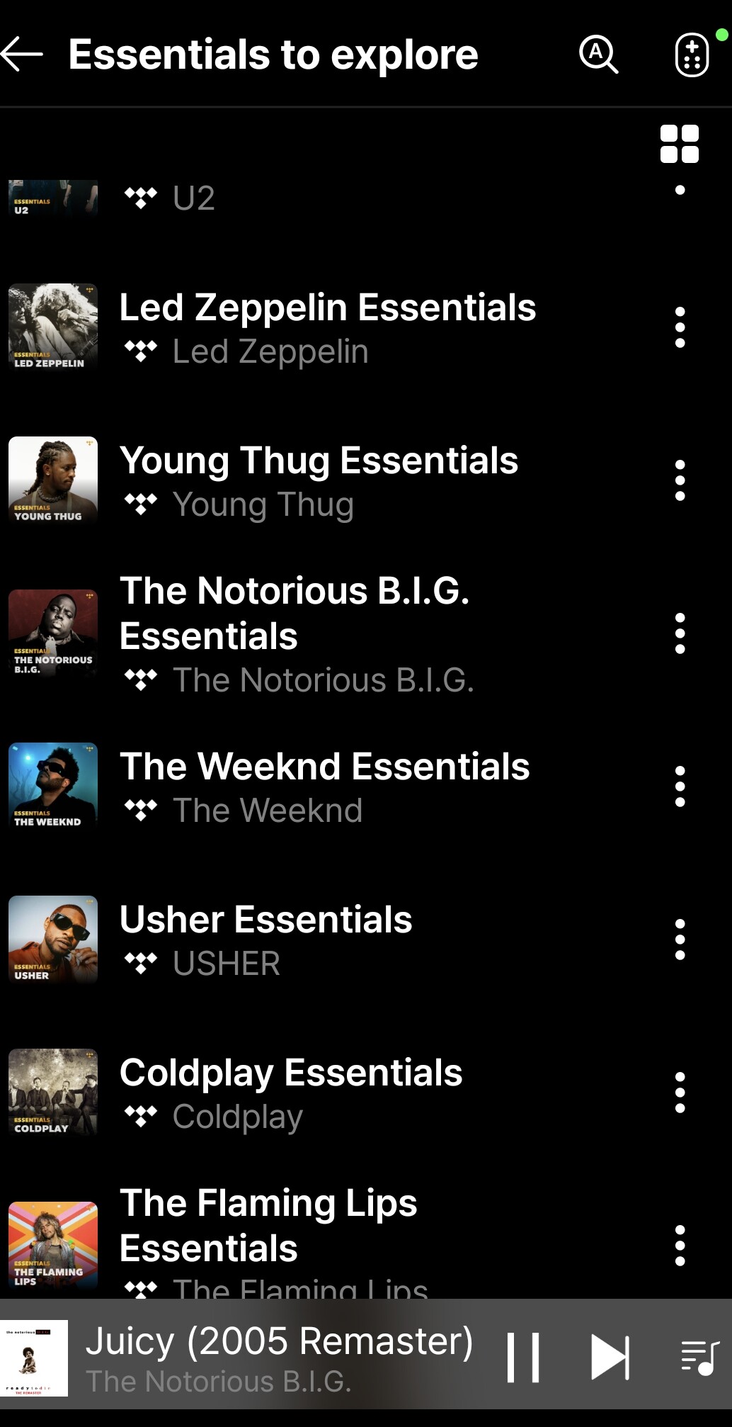
Thanks for the response. I’m not sure what screen you are showing above (“Essentials to Explore” is not one I see anywhere), but I see no means of changing the view on that screenshot, or on any screen that I typically use (normally Music > Classification > Artist).
As for the characters, they are on the bottom right here.
1 Like
Music streaming apps like Tidal offer two viewing options, as shown in the icon below. We will review the feasibility of supporting these views in the music category and implement them if possible.
1 Like
This just emphasizes how you’re creating a less robust interface for a large segment of your user base, and perpetuating an inconsistent experience across the platform.
Are you able to address my issue with the unnecessary characters in the right-hand navigation bar? The fact that including those means excluding actual letters is just baffling to me.
#2 has been fixed in the new version of the Android app…Thanks Rose Team
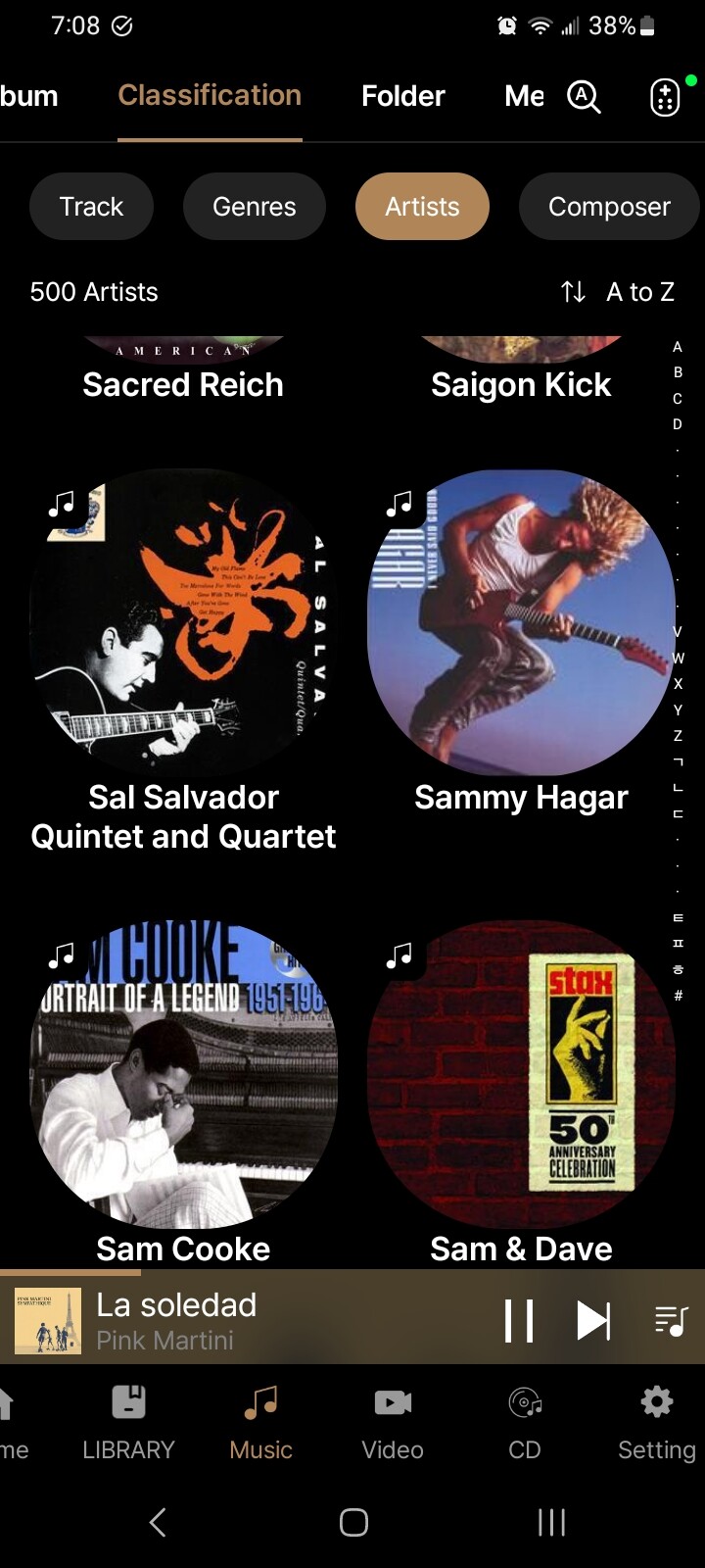
When you tap the characters in the right-hand navigation bar, tracks starting with the selected letter are displayed.
This feature was added based on requests from many users.
1 Like
I agree that having the characters helps. But the alphabet ends at Z. I don’t understand why all of these random characters are showing after that, especially since none of them appear in my library, and thus are limiting visibility of characters that do appear.