I wish the Rose team would do this:
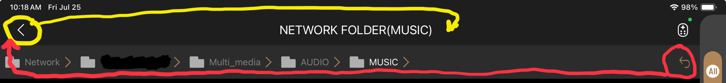
To me when I navigate my local files it’s too easy to hit that icon circled in Yellow, thinking I’m going back one level. I think it has to do with being too used to how Microsoft arranges their icons.

I wish the Rose team would do this:
To me when I navigate my local files it’s too easy to hit that icon circled in Yellow, thinking I’m going back one level. I think it has to do with being too used to how Microsoft arranges their icons.
The best addition to the ROSE 130 is a roon server, so that you can use the RS130 as a roon ednpoint which is about the only thing it does well. 
what does the “<” icon do when selected?
BTW, Do you use the RoseConnect app on android, ios or windows?
This is a good idea for Roon users. I’m uncertain if the RS130 CPU & Operating System’s storage are powerful/large enough to efficiently process a Roon Server. HiFi Rose to decide.
However, this topic was created in hope to improve the RoseConnect app’s User Interface. Thus, my preference is to recommend RoseConnect UIF improvements before developing a Roon Server ← exception would be if the Roon Server can easily be developed (assuming the RS130 owner/user has the appropriate subscription license).
+1 I agree with that… UIF first 
It kicks back up to the main “Folder” screen. I think its location is in the wrong place. Frankly, I think the whole “Music” interface is non-intuitive and clumsy.
RoseConnect on iOS.
I meant you can add your own roon server for about 1/10th the cost of the ROSE and it will be the best “enhancement” to your User Experience UX.
Please consider the following to help the User Interface experience and to especially help newcomers.
After the Remote Control icon (in the top right corner), place a question mark icon followed by the wheel icon (i.e. the setting icon) ← remove the “Setting” function in the screens’ left panel. When user selects the question mark icon (i.e., the “Help” icon), show a popup menu. To start, consider including the following in the help popup menu:
For #1 above, list every unique icon; for each icon, explain what the icon does (e.g., for me, the most unintuitive icon is the folder icon that has a + sign inside the folder).
For #2 above, list every unique symbol; for each symbol, explain what the symbol is and where does the symbol typically appear (e.g., list the symbols on an Album Cover Art’s left top corner)
For #3, list commands that can be activated via long-pressing a remote-button & by multi-remote-button combinations like “Activate the VU Meter panel display” (see RS130 User Interface - #132 by joyofmvid)
For #4 above, walk through this community’s FAQ Topic & RS130 User Interface topic. Copy some of the key questions’ answer that are User Interface related, like:
@ROSEHAN, please for your consideration:
Add @StandardModel’s requested radio, Shazam, Home listing,… improvements delineated at Time for a 2024 Wish list? - #12 by StandardModel and at Time for a 2024 Wish list? - #38 by StandardModel
Add export/import & backup/restore feature delineate at Time for a 2024 Wish list? - #19 by joyofmvid
To improve user experience, permit user to turn on the "Currently Playing” view for the Front Panel. In essence, this view to:
Use icon sizes, font sizes & font brightness that’s easily viewable from 12 feet.
To improve user experience , permit user to
As tracks are added to a playlist, always add to the bottom of the playlist ← I agree with the request posted at Inverse Playlist and sorting - #10 by Querner
(Note: HiFi Rose developers to use their standard icons. The icons shown below are just for descriptive purposes.)
Enhance user experience by dedicating the following two lines at the bottom of every screen. These lines shows what’s currently playing and adds functions applicable to the currently playing media type & to the currently playing track.
For example:
Album: Michael Jackson - Thriller 1982 (Track 5 of 16) ![]()
 °°°
°°°
Michael Jackson - Beat It (3:24/4:18) 
![]()
 °°°**
°°°**
(1st line: ← icons/font to be bigger & dimmer color than the 2d line
The 1st line indicates the currently playing media type followed by a colon: e.g., Song:, Album:, Playlist:, Folder:, Cassette:, Boxset:, Vinyl Record: (for every media type except “Song:”, show the following after media type: “aaaa - tttt yyyy (Track n of m) ![]()
 °°°” ← note: to indicate these icons are being applied to the media type (not to the currently playing track), make these icons larger then the 2d line’s set of icons, and make the °°° icon three vertical dots (not horizontal dots).
icon appears only if the media type is in playback mode ← for boxset, vinyl record or cassette, the icon appears only if the media type or media type’s disk/side is in playback mode
icon pauses media type playback & current track playback then changes the icon to icon pauses media type playback & current track playback then changes the icon to icon pauses the media type’s disc/side playback & current track playback then changes the icon to icon appears only if the media type is in playback mode
icon stops media type playback, removes all corresponding queued tracks and erases the 1st & 2d lines icon. stops media type’s disk/side playback, removes the disk/side’s queued tracks, and then proceeds to play the next disk/side which, in turn, updates the 1st & 2d line’s info. ← if the last disk/side was stopped, the 1st & 2d lines are erased. icon toggles the media type’s Like tag field on/off (note: icon is a line-drawn empty heart when the media type’s Like tag is off)(regarding each of the above popup menu’s action, do the action and save the metadata setting in the corresponding media type’s tag)
The 2d line indicates the currently playing track followed by user selectable action icons. On this line, show Artists - Song Title (hh:mm:ss/HH:MM:SS) ![]() °°° where hh:mm:ss is the current remaining playback time’s hours, minutes & seconds, HH:MM:SS is the track’s total time in hours:minutes:seconds, followed by the track’s action icons: (Note: Show hh: & HH: only if it’s 1 or greater). (Note: If the “Artists - Song Title” is too long, truncate the song title & put two dots at the end of the truncated song title.)
°°° where hh:mm:ss is the current remaining playback time’s hours, minutes & seconds, HH:MM:SS is the track’s total time in hours:minutes:seconds, followed by the track’s action icons: (Note: Show hh: & HH: only if it’s 1 or greater). (Note: If the “Artists - Song Title” is too long, truncate the song title & put two dots at the end of the truncated song title.)
icon pauses the teack’s playback ← note: the Play icon triggers Next Track to start playing; if currently on the last track of the media type then the next media type’s item (or the next queued item) is played icon toggles the tracks’s Like tag field on/off (note: icon is a line-drawn empty heart when the track’s Like tag is off)(Note: To prevent mistaken user selection, ensure sufficient spacing between the icons.)
When selected, a Pop-up Menu appears with “Create new playlist” command at the top, followed by a list of playlists (Each playlist name is shown in the list; the list is ordered by last modified date/time).
In a previous post (see the RS130 User Interface - Simplify & Make UIF More Intuitive - #12 by joyofmvid post), I recommended a Currently Playing front panel view ← make the Currently Playing view the same as this post’s noted two lines with Metadata centered on a third line. Also, if there’s sufficient room, put the currently playing track’s Album Cover Art on the left side of the front panel.,
In your drawing below, it would be more intuitive if user can simply select the desired folder name in the folder list ← e.g., user could select AUDIO, or Multi_media, or Network. With this function, the entire “<” icon line is not needed; hence can be removed.
Disk: > Folder 1 > Subfolder 1 > Subfolder 2 > files in alphabetical order
In the RoseTube image shown at How to enable full screen album art? - #6 by ZABOKS
To improve the readability/user understanding, I recommend this string be changed to have a dot between each audio metadata field & show the audio file format in capital letters, as follows
Note: 44,1 and 44.1 represent the same decimal number but follow different regional formatting conventions. Hence, create a user setting: "Numeric decimal values to be shown as 44,1 or 44.1
Also change the postioning, etc of the Album Artists, Album Title & current Song Title (which is currently shown on the left side of the album cover art):
change from:
Magnetic Lies
Convergence
Malia
change to:
CONVERGENCE ← larger font, center this
by: Malia & Boris Blank ← larger font, center this
(Vinyl Record) ← center this (show only if user specified the Album Source tag
then left justify:
Current Song (Side B, Track 3 of 6):
Midnight Lies ← show just above the playback line
nn:mm -------------------------------------------------------------------- xx:yywhere nn:mm is the current play time & xx:yy is the song’s total time
Put a bit extra vertical spacing between the Album Info and the Current Song Info (spacing should make the playback line, one line above the cover art’s bottom edge.
Plus, move the “cover art” 5 character spacing to the left and start the current song & playback line, the same spacing to the right of the cover art as that on the left of the cover art
Last, use a larger font for the Album Title & Album Artists.
On the currently playing banner at the bottom of the display, enter a vertical ellipsis “⋮” icon on the right-most side of currently playing. This icon is for a pop-up menu applicable to the currently playing song. In this pop-up menu, show the options:
Note: For additional pop-up menu options, see the above post at RS130 User Interface - Simplify & Make UIF More Intuitive - #14 by joyofmvid
FYC to post #14 above:
In the bottom-most banner line, consider instead of
Capialize the album info, put space between “/” on the song line & put thumbnail image to the left-most side of the 2 lines:
[–]ALBUM: MICHAEL JACKSON - THRILLER 1982 (Track 5 of 16)

[ --]Michael Jackson - Beat It (3:24 / 4:18)
If the album was played (not the individual song) then show:
[ --]ALBUM: MICHAEL JACKSON - THRILLER 1982 (Track 5 of 16)
[ --]Michael Jackson - Beat It (3:24 / 4:18)
How about we make another Category of posts called “Interminable Suggestions That Will Never Be Read And Will Definitely Be Ignored By HiFi Rose?”
I know for a fact that HiFi Rose is reading these posts. ROSEHAN has been PM me a few comments. I pre-notified ROSEHAN. In fact, he has been helping me by sending me a few screen shots.